
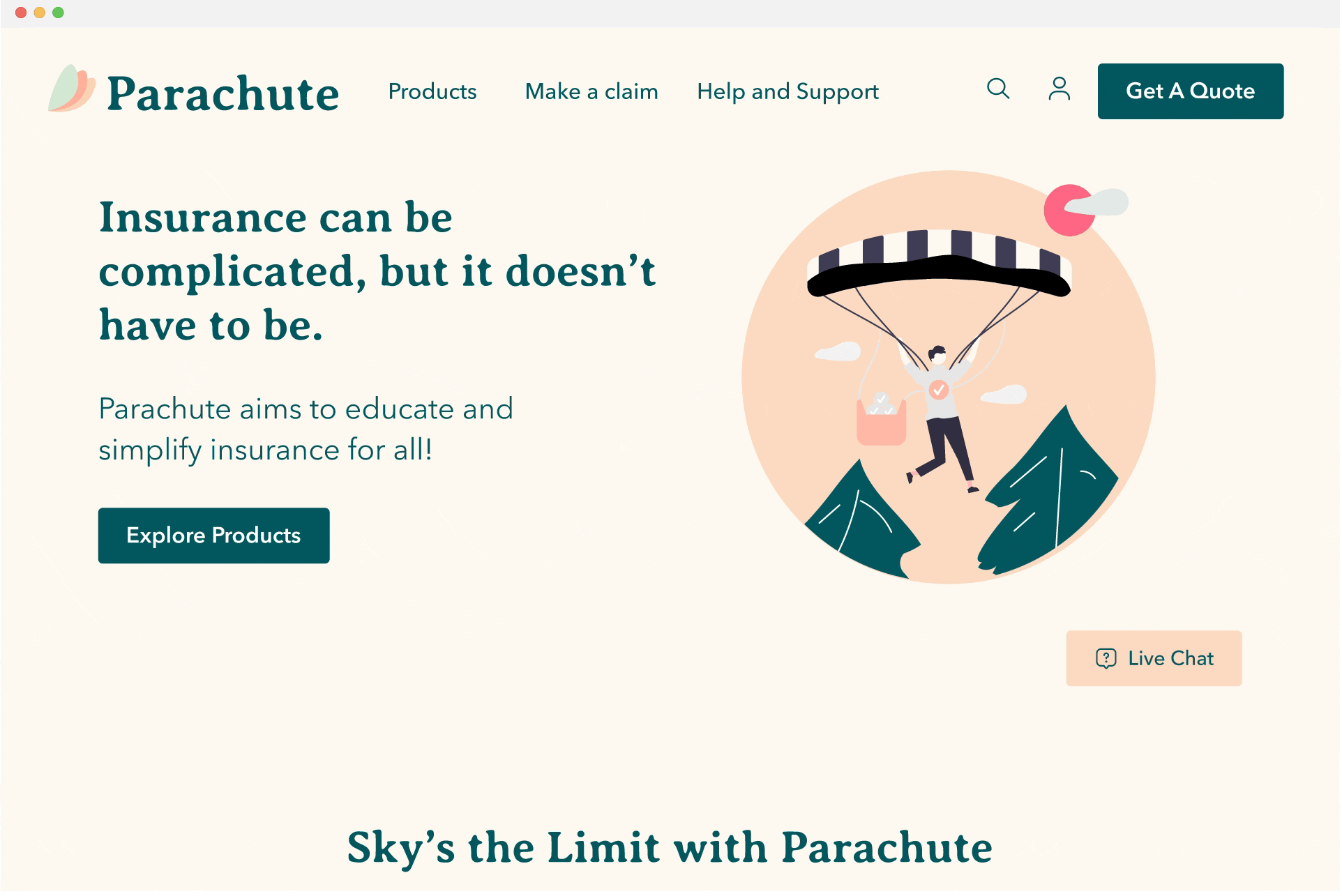
Parachute Insurance
A refreshed online shopping experience that prioritizes educating new insurance buyers to make confident purchase decisions.
Role
Research, Branding, Interaction Design, Prototyping
Tools
Figma
Duration
6 weeks
Overview
Parachute Insurance wants to sell insurance to millennials online.
Parachute is a B2B insurance platform providing insurance policies for 30+ years. To stay competitive in the digital landscape, Parachute is looking to expand their business into the direct to consumer space by targeting the new generation of insurance customers that prefer to shop for insurance online.
Challenge
Customers, particularly young adults, are overwhelmed with the complex terminology of insurance and struggle to make confident purchase decisions online.
So what needs to change?
Solution
Parachute aims to ease the insurance buying process of customers through a new responsive digital website that values transparency, education, and customer care.
✅ Informative Shopping
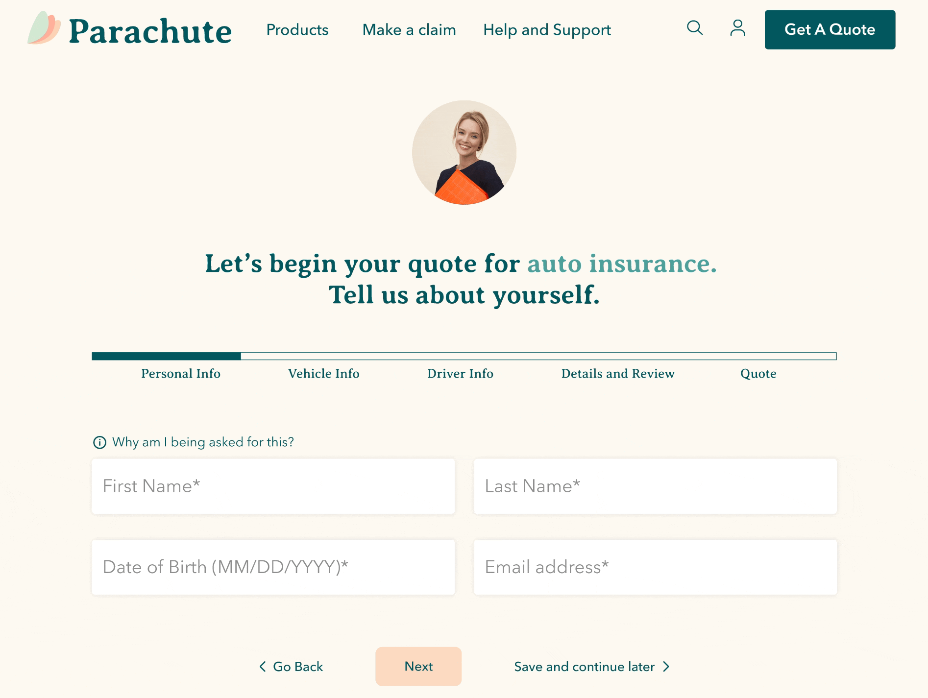
Educate customers with relevant tips to justify personal information input, especially in the quote wizard.
✅ Honesty is the Best Policy
Provide thorough and transparent information for customers to make confident purchase decisions.
✅ Refreshed Branding
Elevate customers’ perception of insurance with a humanized approach for fresh and youthful branding that is engaging and relevant.

Market Research
Deloitte and McKinsey revealed top customer considerations when searching for insurance online.
👩🏻💻 responsive customer service | 💻 intuitive digital capabilities | 🎯 personalization | 💸 price | ⚖️ company reputation.
Competitive Analysis
In analyzing key players, three main observations were:
many websites launch users to find a quote almost immediately without providing context of what product offerings are.
desired information can be difficult to find as they are nested differently, too hidden or too cluttered.
easily identifiable branding.
Understanding the User
Inquire how users select companies and understand their expectations and desire of how to navigate purchase decisions online.
3 users in different stages of life participated in 45 minutes interviews.
💎 Motivations
👎🏼 Pain Points
Seamless search process
Users desire organized information that takes less than three clicks to find.
Easy on the eyes
Users are attracted to clean and simple websites that highlight how companies value quality customer experience.
Value transparent pricing
Most users prioritize cost and are fearful of blindly paying extra fees when selecting insurance packages.
Find insurance “complex” and “daunting.”
Most users possess a baseline level of anxiety regarding insurance even before the research process begins.
Want to explore freely
Users displayed annoyance at how websites can be aggressive in pushing product offerings immediately without providing any context.
Value transparent pricing
Users disliked providing personal information before being made aware of pricing or product offerings.

Scenario: New user wants learn about insurance and purchase an auto insurance plan.
User Flow
How might we provide an experience that educates and informs the user’s decision-making process without being “pushy” or confusing?
Based on interview findings, users, particularly new insurance users, are cautious against calls to action and prefer to explore and learn more by themselves before having the confidence to take any action, such as participating in the quote wizard.
Persona
Sienna is a young working professional who is navigating new adult responsibilities such as insurance which was previously taken care of by her parents.
As a financially-conscious young adult, she has to assess whether offerings are “worth it" from adequate research.
Sienna’s ideal company values transparency and understands that users may be uneducated regarding insurance.
Project Goals
Users would only buy out of necessity and cannot justify paying for additional unnecessary features even if there is an overall discount.
User interviews uncovered that customers would be interested in bundle packages; this option was removed because while it may be profitable to keep business costs low and provide an easy solution.
“I would have to really consider how much I am saving but it’s probably not worth it for me to buy a bundle package for a car and house when I don’t even have my own place”.
Sketches
At this point in the process, I was getting pretty lost. So I went back to my persona and research to iterate upon new discoveries for the sketch explorations.
At this early stage of my design journey, I realized I had an aversion toward sketching. Despite sketching a very freeing and cheap way to ideate, as a perfectionist, I had to overcome the mental block that I would have several failed sketches to get to my “perfect” idea and even then that will probably get scratched.
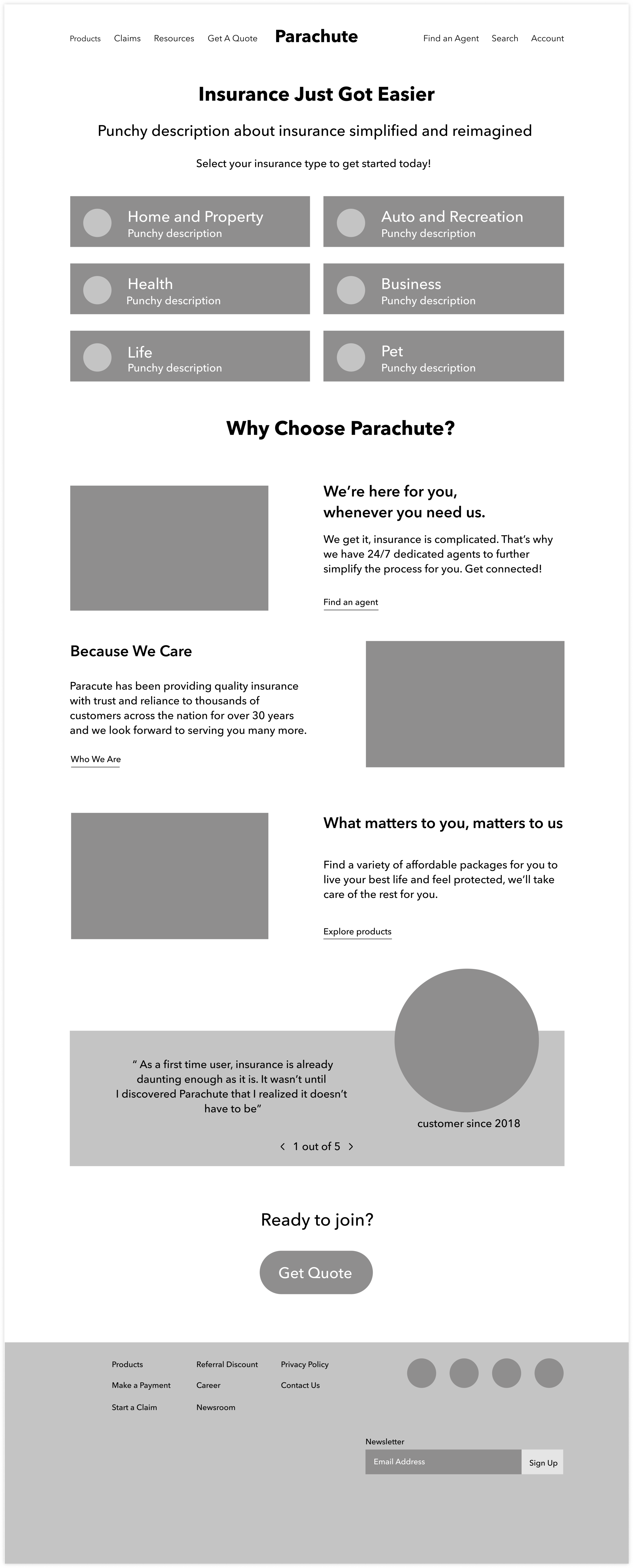
Mid-Fidelity Key Wireframes
Results from an open card sort revealed that users prioritize products, prices, customer service, and customer testimonials.
I utilized negative space to create separated information groups to lessen the risk of cognitive overload. Primary shapes include squares with radii and circles to evoke a sense of friendliness and approachability that insurance may lack.

Responsive Wireframes
Scenario
You are new to insurance and visiting Parachute to learn and potentially purchase auto insurance.
Task
Participants explored the Home Page, Auto Insurance Product Page and quote wizard.
Prototype and Testing
Moderated usability tests were conducted in person and online with participants ages 22-27 on the Figma prototype.

Iterations, Rinse, and Repeat
High-priority iterations were designed in response to user feedback.
As I revisited these iterations after a few months of practice pushing pixels, I harnessed my UI skills to redesign the Parachute website to display information more visually engaging and consistently.
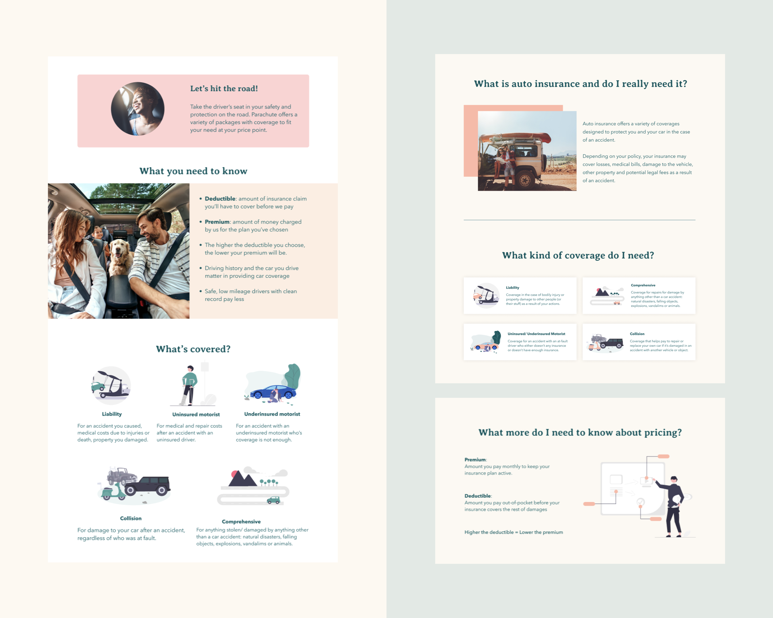
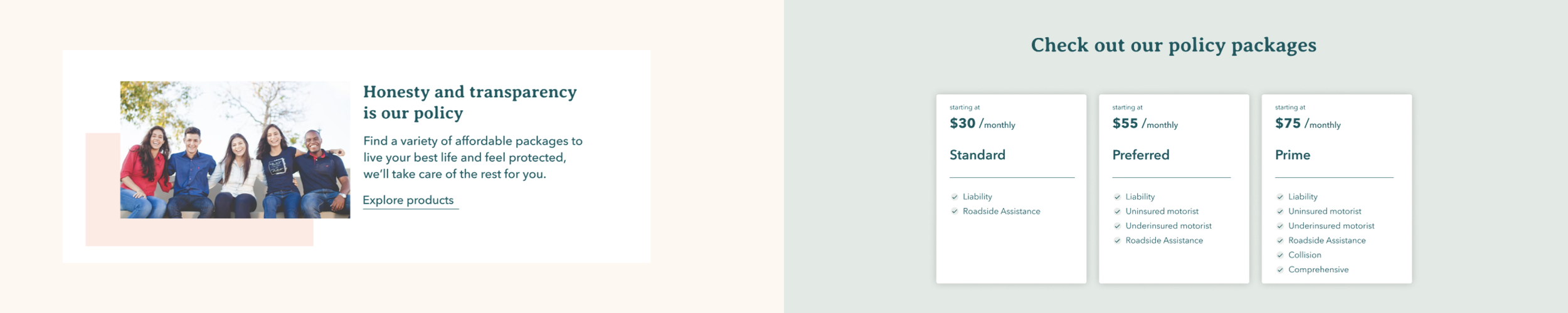

Clearly display financial packages to set context for customer
Present pricing options upfront on product page
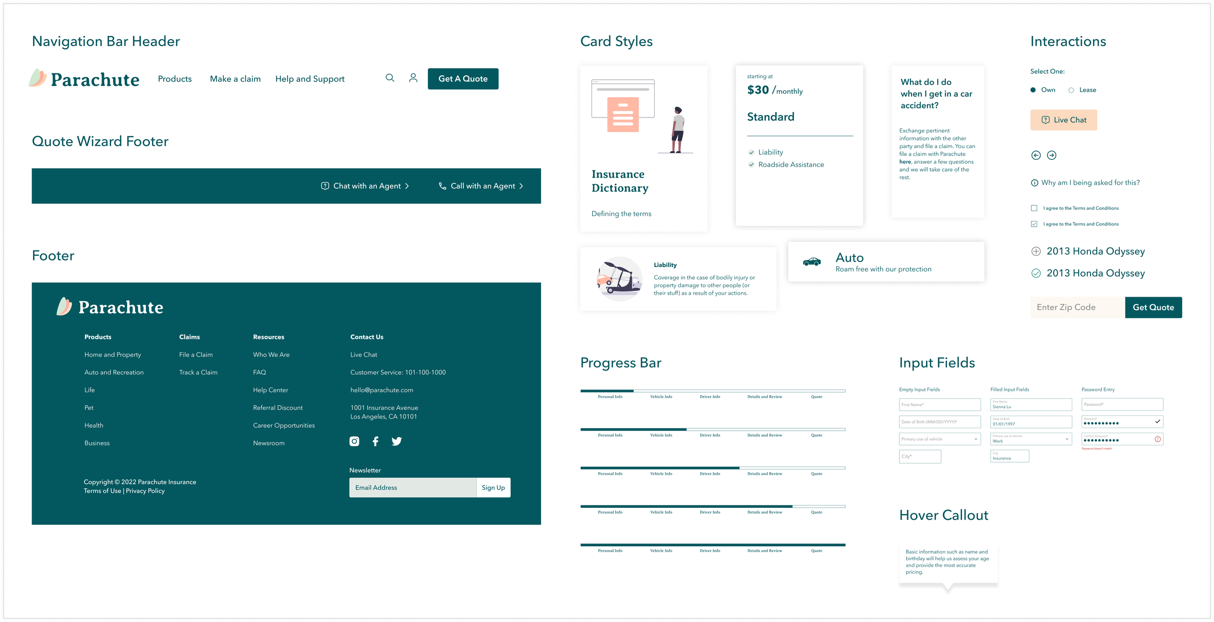
Integrate tooltip to justify solicited personal information in quote wizard
Hover over info icon to access tooltip
❌ Text is too vague to get any value
❌ Confusion on whether What’s Covered options are all included in a package or only select few
✅ Guide the customers along with questions in their thought process
✅ Reduced amount of text with clarified information
❌ Other than this blurb, there is no indication of prices
❌ Frustrating to have to go through entire quote process just to receive a price that is out of budget anyway
✅ Provide price context for customer before launching into quote process
✅ Assures customers with transparency of starting price and gives them the power to decide whether they would like to continue
❌ Users are uneasy with the commitment of providing so much personal information
❌ Users are overwhelmed by the amount of input on each page
✅ Establish trust with tooltip to educate customers on how the questions inform the final quote price.
✅ Reduce cognitive overload of input info on each page
Refine copy and language of information and instruction
Rephrase section titles into questions.
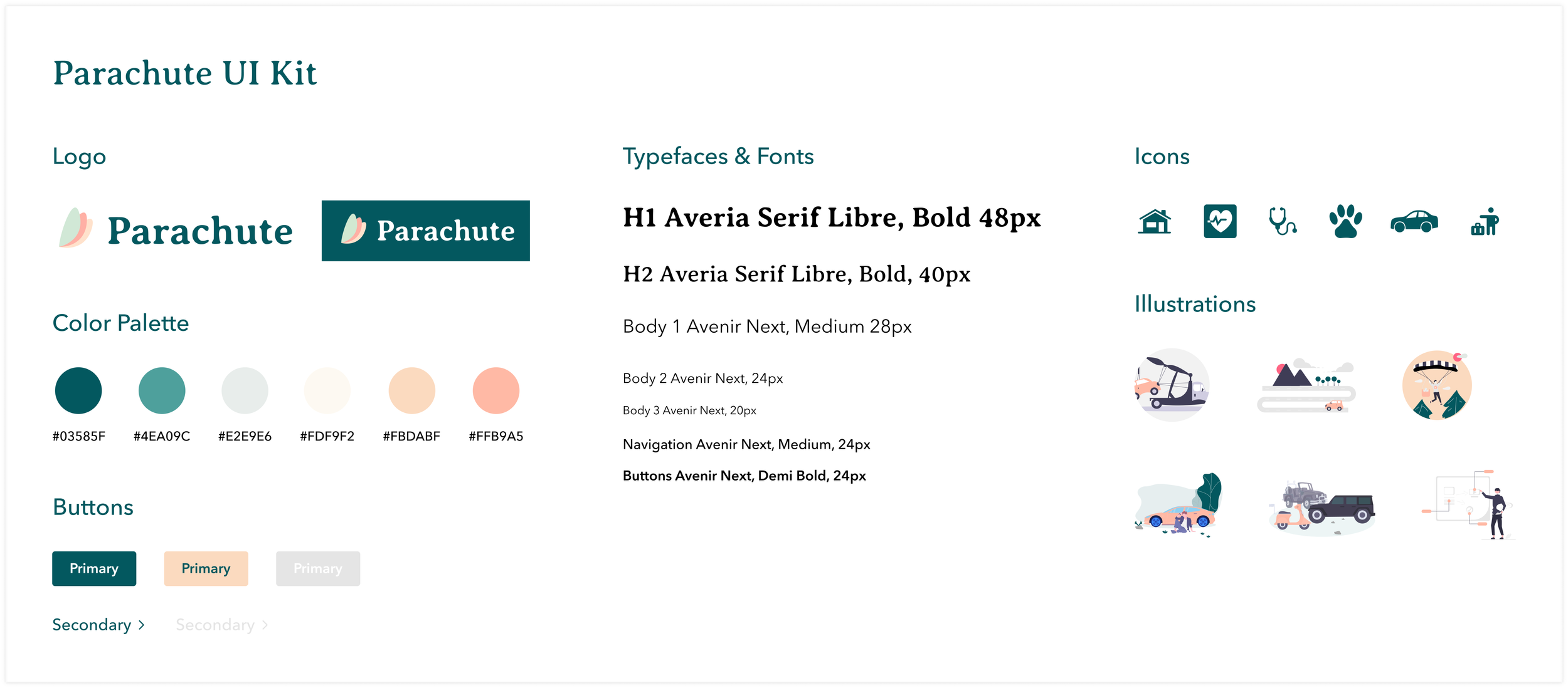
Branding
Parachute is open to breaking industry barriers in favor of a more pleasant user experience so explorations in rebranding included a new color palette, new brand name and new logo.
Parachute insurance will be there to safeguard customers as they live their daily lives with the sky as the limit.
Color
I wanted to reimagine what is typically associated with the cold starkness of insurance with feelings of warmth, trust, and approachability with color.
Green signifies growth and money speaking to the emerging youth
Mint and peach bring freshness and warmth to soften the breaks.
Name and Logo
The new name and logo change takes inspiration from parachutes, which can be seen as a picture of protection amidst risk.
The logo positions three wings to resemble the pattern found in parachutes and as flower petals/leaves to symbolize the growth and maturity of our target audience as they navigate newfound young adult responsibilities.
Next Steps
Refine the quote process even more by adding additional info blurbs to guide the users along the process to affirm the educational and credibility aspect
Reconsider the account creation flow to integrate seamlessly without tasking the user for premature information.
What I’d do differently
This was my first UX project (yay! and sigh of relief), which was gratifying and challenging. Since it was my first hands-on interaction with many of these principles and concepts, it took me a while to grasp and implement these ideas into my project. I got caught up in the details and lost sight of the big picture. Here are a few valuable lessons I’ve learned:
Your research is your truth.
As I drew inspiration from existing competitive insurance sites, I wanted to incorporate all their best features into my design until I got so overwhelmed that I lost my focus. My plan didn’t seem to know the problem it was solving, much less having a starting point. As I revisited my user interviews, persona, and empathy map, I was able to refocus on my user and their pain points to readdress their needs and implement the relevant solutions based on my research.
1st time is never the charm.
I always seemed to hit a wall whenever the opportunity for sketching surfaced. I was terrified of drafting multiple designs and STILL not being satisfied. I hated starting from scratch until I rewired my approach in the design process by relinquishing any expectation upon myself to produce good designs and that done is better than perfect.
Iteration is not failure but opportunity.
I love iterating…. now. But early on in the design process, I saw it as something I always “didn’t get it.” Upon each iteration, my perspective was enlightened and broadened to shine on issues and opportunities that would not have surfaced had the design not been refined.